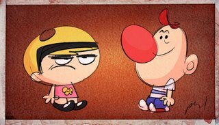
This sketch came out of a conversation with Mr. C.H. Greenblatt. We were talking about how much we both enjoy Aaron Springer's Billy. I was trying to remember his treatment and did this sketch. They're totally all me, but the influence of Carl's boarding and Aaron's have rubbed off on me a bit. You should really see the way Aaron draws him, it's pretty funny.
I guess I'm writing because I wanted to mention my favorite part of designing a board-driven show. (I think it may also be the hardest part for me personally.) I love getting boards that are full of great cartooning and drawings that are not necessarily "on model" but are definitely in character. Sometimes I feel like as a designer all I'm doing is totally watering down funny drawings by trying to bring them more "on model." I'm supposed to be plus-ing them, but I find that I'm walking a pretty thin line at times. Some days I wish i could just blow up board panels and just clean them up as is. Leaving in all of the oddities that are particular to a specific board artist. I think that kids will still know that Billy is Billy, even if in the first half of the show he looks like Alex's and the second half like Carl's.
I think that one of the most amazing things about animation is that artists can leave such a personal mark. A mark that on some productions is supposed to be ironed and hammered away, into whatever on model / cookie cutter standard designs exist for the show. I know that there are some exceptions. Some shows do embrace stranger drawings more than others, and some may require a more standardized look for whatever reason. I don't even know if I have a point to make, but I guess that I'm just starting to really realize how much I appreciate it when the artist isn't removed from the art.
Or maybe I'm realizing that I want to be a board artist.
I dunno. I'm tired, and miss my cintiq.
-p
feeling: like the Apple Pan did me wrong today. bad apple pan.
listening to: my tivo asking if it can change the channel. good tivo.


